
Typology
Definition:
A classification according to general type, especially in archaeology, psychology, or the social sciences.
“A typology of Saxon cremation vessels”
A typology is in simplest terms is different types of the same thing. In photography is a record of similar types, but the term typology is not a photographic term.
Typologies are often presented within a grid, details are easier to pick out when images are presented in this format, and the uniformity of the images presented in the grid has an overall aetheticlly pleasing effect on the viewer.
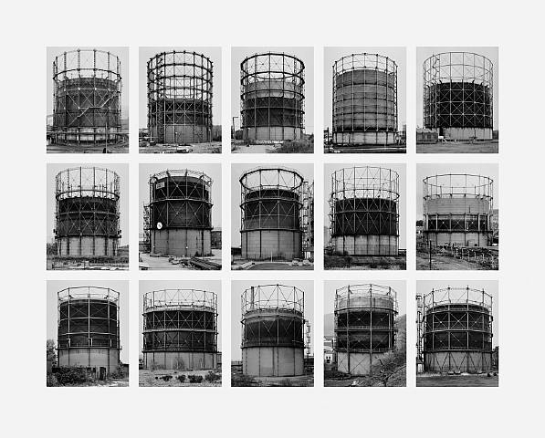
Typology was first used in the photographic context by Bernd and Becher in the 1950’s/1980’s.
It was Bernd and Becher that created the typology of the cooling towers. The cooling towers were not photographed for an aesthetic reason but more for recording in a factual way.
They described the subjects within their imagery ‘buildings where anonymity is accepted to be the style’. To stick to the form of a typology, each photograph was taken from the same angle. They wanted to record the ever-changing environment. The typologies recorded a moment in time and make the viewer consider the things place in the world.
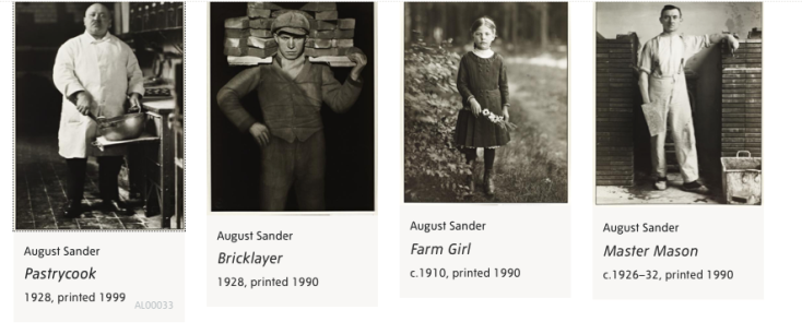
One of the initial photographic typologies was the work of August sander, a German photographer who brought forth the project ‘people of the 20th century’ which consisted of 40,000 negatives that were destroyed during WW2 in a fire. He produced a series of portraits called ‘The face of our time’ in 1929. The portraits were sorted into categories by sander according to profession and class. Sanders strict work and approach to photographing his subjects influenced later photographers such as Bernd and Becher, Thomas Ruff and Gillian wearing to name a few.
There are two types of typology.
Formal and Informal.
One type of typology that we looked at during lecture was the work of James Mollinson.
I watched a documentary that included his projects, where children sleep, James and other apes and finally The Disciples. Mollinson’s work is very appealing to me and I was drawn to the style of photography and approach he had taken with his work.
Where children sleep
‘Stories of diverse children around the world, told through portraits and pictures of their bedrooms’
The reason behind this project was to show how a bedroom reflects the child. With this project, he took a passport image of each child on a plain background with all the same set up, this was to show we are all the same. And the picture shown alongside was that of the bedroom and this provided the narrative.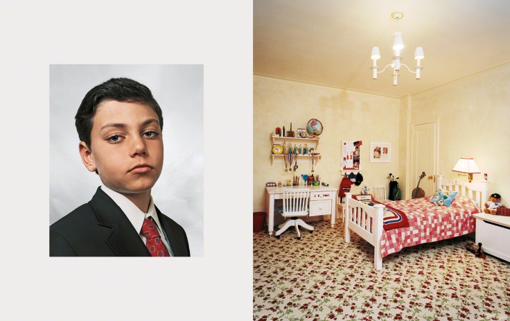
Jaime, 9, New York, USA
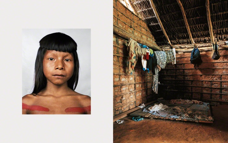
Ahkôhxet, 8, Amazon, Brazil
When we sit, and take in these images, you really can see how a child’s bedroom reflects the child. But would you be able to make that connection by purely looking at the passport image? This is one aspect of this project that really sparks an interest in me and something I would like to try myself, if not for my own typology project, for a personal piece of work.
Another set of images we looked at from Mollinson was James and other apes.
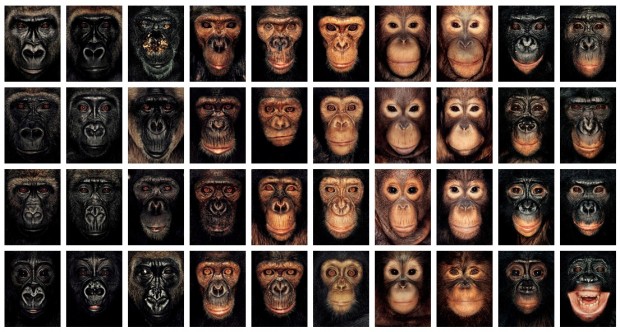
These images were taken in the aesthetic form of passport photos, this was done to make you look at them as individuals. The way the images are set out Mollinson says that we ‘see our faces reflected in the chimps’. Each image was taken with a polaroid. I think the reason he did this was to make us connect with the photographs and provoke emotions as see ourselves and maybe family members in the chimps faces. It isn’t until he has shown all images of the apes that he reveals the reason behind his typology is that all the apes that have been photographed have had their parents killed in front of them, for various reasons such as meat trade and medicine.
The final typology we looked at in the series by Mollinson was the disciples.
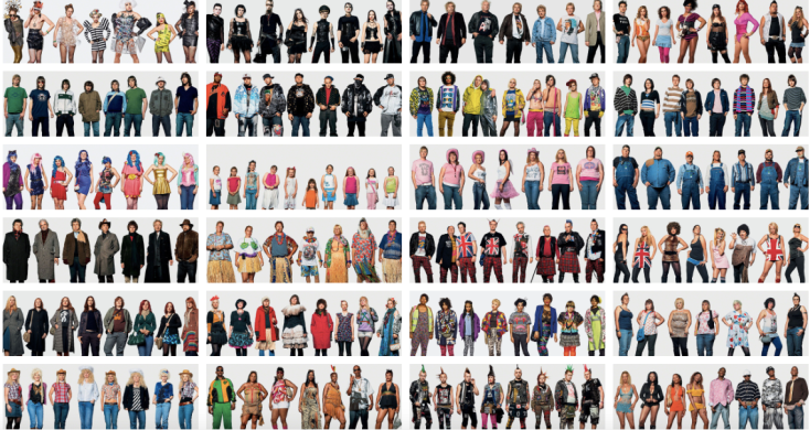
This typology showed how individuals form groups to give identity. Mollinson noticed that individual images didn’t have the impact he wanted but when the images were grouped together the impact was there.
Over three years he captured fans at different concerts. He found it interesting how different groups of people attend different concerts and how the groups would often look like the celebrity they were going to see.
Further Research
Mike Mandel
Grant Legassick
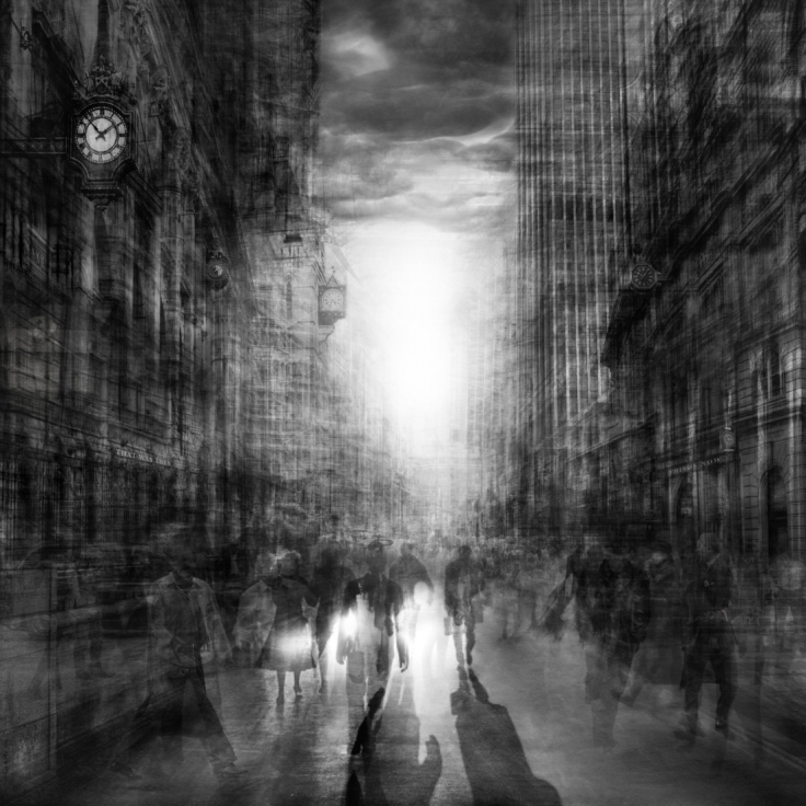
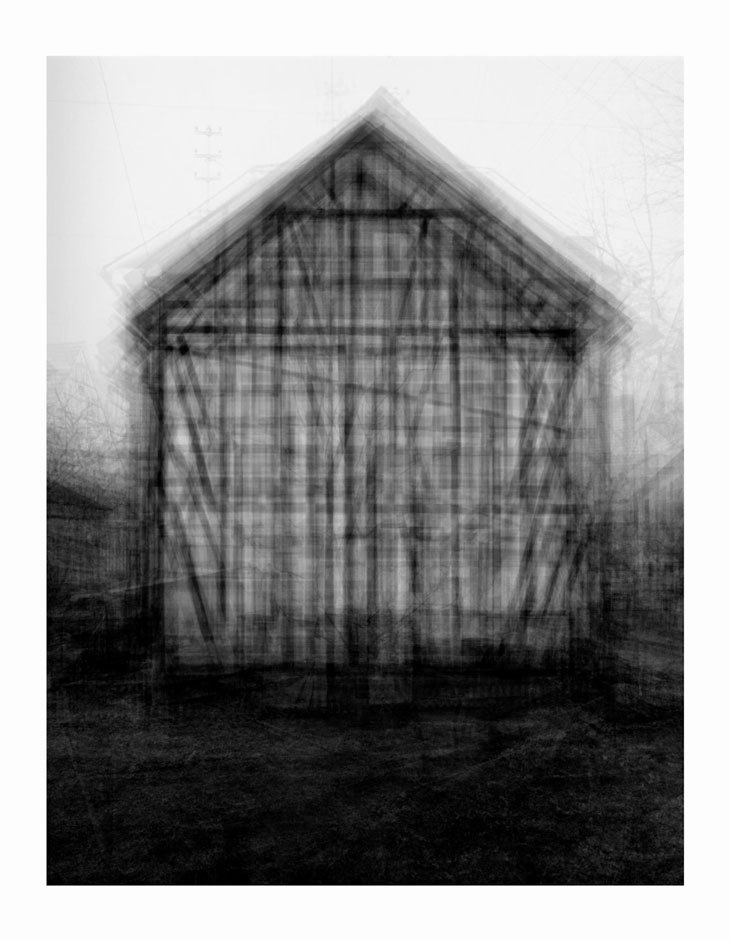
This series is named Urban Etchings, created by contemporary artist Grant Legassick. His love to study the urban environment brought him to the idea of taking multiple images and layering them over one another to give the impression of a fine, delicate pencil drawing or metal etching.
Luke Stephenson
Steve Tyler
Steve explores the concept of mass consumerism and how much we consume as individuals daily via the use of typologies.
He works and displays his typologies in grids of 81. There is a deeper meaning to his photographs and that is that he hopes to expose how much we consume and waste, whilst other countries suffer.
Idris Khan
Idris Khan’s series appropriates the Bechers’ imagery and layers their typologies into single images with the use of editing. In the particular example used above, Khan has used multiple images of American-style houses taken by the Becher’s and digitally layered them creating a dreamlike image. The images taken by Bechers’ are almost the same, Khan’s has taken the images and tweaked the contrast and opacity so each layer can be seen in the one image.
Brief
For the brief we have been given the task of creating two sets of formal typologies that include no less than 9 images. Finally as an experimentation we have to then select a set of images in the form of a typology and layer them all together and produce an A2 print of the image such as the work of Idris Khan.
Ideas
Toilet cubicles
Door handles
Windows
Doors
Tape cassettes
Puddles
First Idea – Nom Nom
For my first idea I wanted to create a typology using small figures. This idea came after my research into toy typologies. After coming across the figures of Nom Noms I was certain I wanted to use them for my own form of typology in a formal style.
For this shoot i worked within the studio using a product table, each time using the same lighting set up. The reason for this approach was to comply with the characteristics of a formal typology.
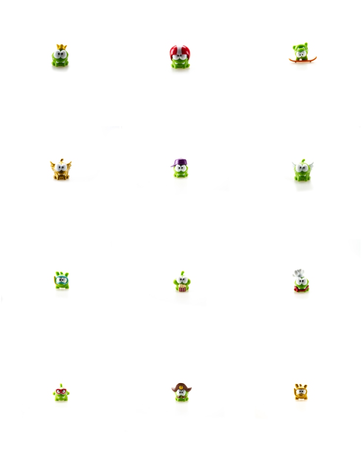
I am happy with my end result of this typology. To achieve the pure white background for my typology I took my final images into light room and adjusted the white balance. After editing the images to the standard I wanted them to be I used photoshop to put them into a grid, the result was the image shown above. The reason i like this image is because it shows a clear concept of what i was tying to achieve. The figures are sharp and rich in colour. And one final reason for liking this idea is the reflection of the figures underneath, I feel it gives the images in the typology depth and an almost tangible feel.

I then took my images into photoshop and adopted the style of work conducted by Idris Khan. Layering the images and changing the opacity of each layer created the image above.
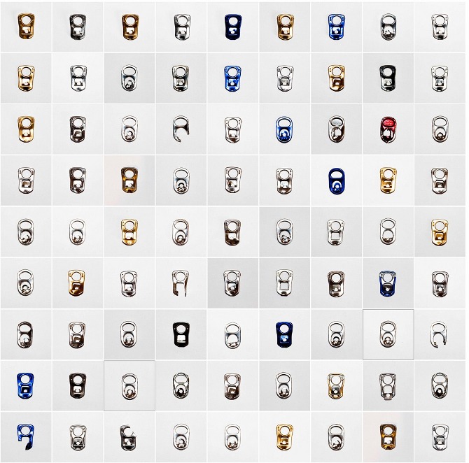
Second Idea – Batteries
My second idea came to mind when I was switching the batteries in my flash. I managed to find 9 different types of AA batteries. The same as the toy figures I used a studio set up. Using the same lighting for each of the batteries to create my formal style typology.
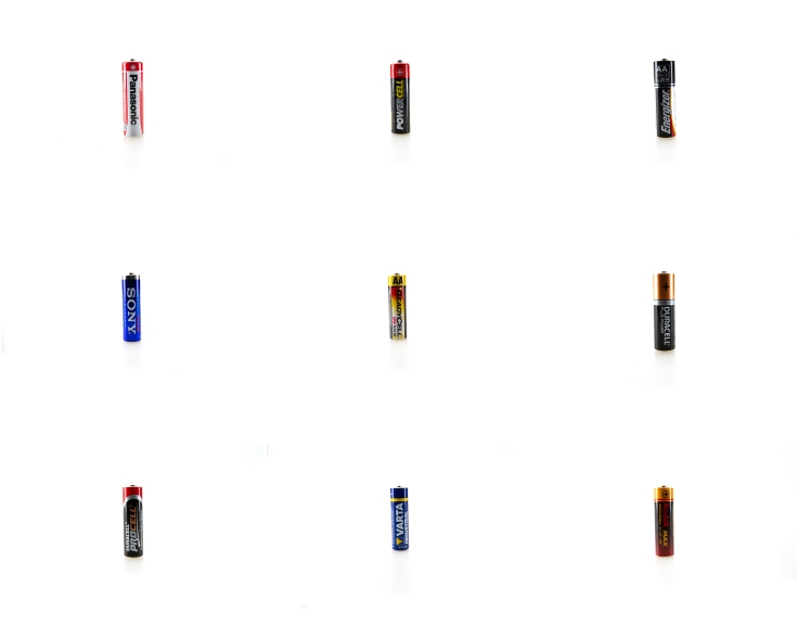
The end result of this shoot again proved to be a successful one. I am happy with the end product and feel it is a strong image. Again I used light room to tweak the white balance to a perfect white for the typology image, giving it an overall clean and professional feel.

The Layered approach for this image worked particularly well. Looking at the image there are some areas that are slightly under exposed but I will correct this before print should i choose this for a final image .
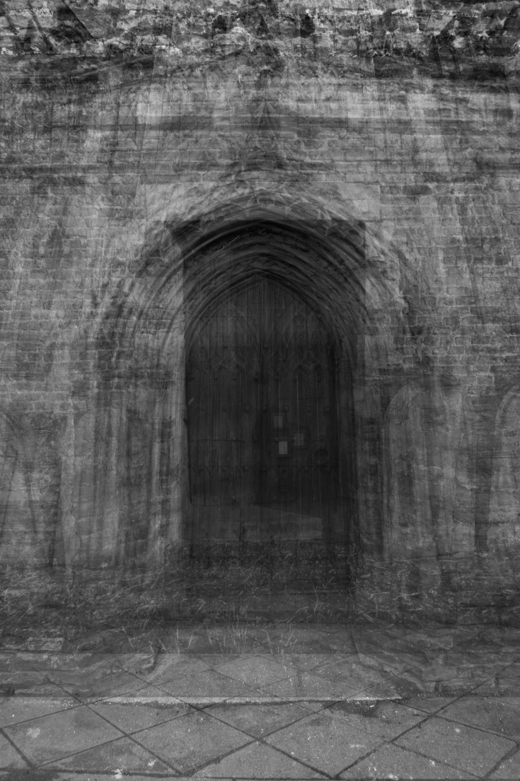
Third Idea – Church Windows
I knew I wanted to create a typology on windows , it wasn’t until i was working on a shoot within a church that I saw how beautiful the stained windows looked, and knew thats what I wanted to create my typology on. I took careful consideration with times of the day to make sure light could be seen through windows but not too harsh light as this would drown out detail.
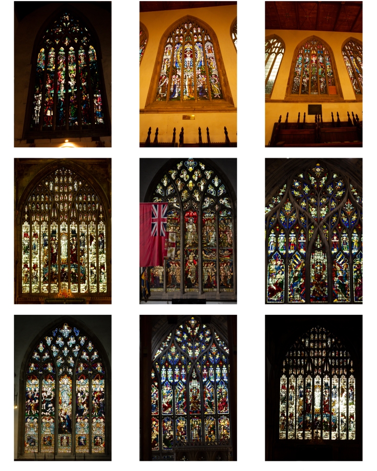
Overall I like this concept, I decided to stick to one church so it was a typology of windows within Trinity church. The only main issue i ran into with this idea was the different lighting within the church. two of the windows also have a lot more wall showing within the image but this is due to not being able to get in the positions needed due to pews and equipment laid out within the church. With this type of typology being more of an informal approach, I knew I wanted to stick with it and the images shown above are I believe my best selection out of the images I managed to get.
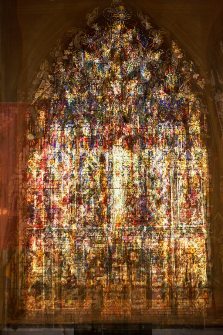
The image above so far is my favourite layered image. The colours seen within the glass window are coming through nicely yet the individual images can still be seen. I particularly like the way you can still see stone window frames through the layers, still giving that window feel to the image and not loosing the overall concept through the layers.
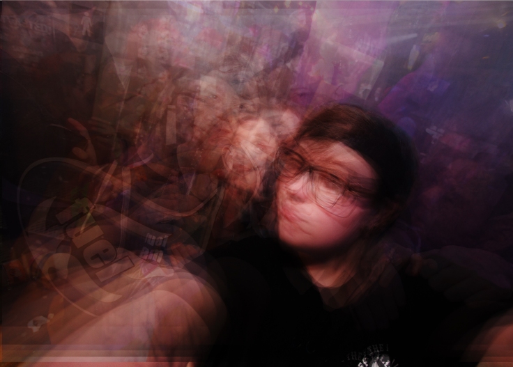
Fourth Idea – Selfies
This was more of an experimental typology using a series of selfies taken with the same setting in the same venues. I wanted to see how the different people and lights captured but using the same concept would look.
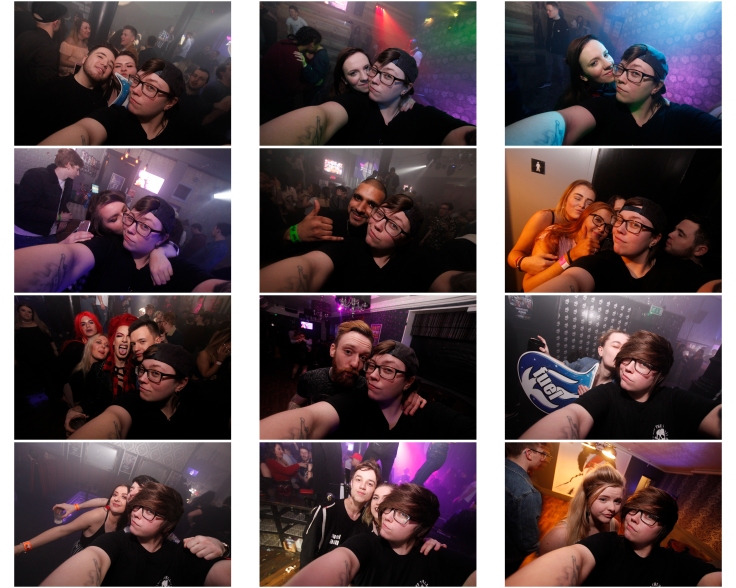
Layering the images created an interesting outcome, although I had fun with this typology, i dont feel its one i would use in my final . in this particualr exmple of layering i used myslef to be the poin of alignment.
Fifth Idea – Drums
For this idea i wanted to take a different take on the term of typology and explore the idea. this is when i came to the conclusion i wanted to photgrpah the same subject in 9 different ways and create a typology of a drummer in a nightclub.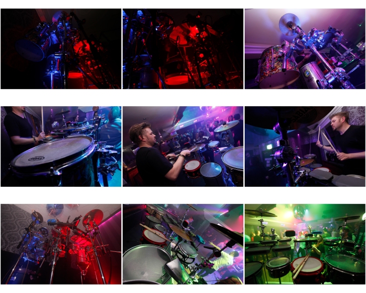
The outcome of this idea is one of my favourites when adopting the non formal style of typology. I deel the colours work well within this typology and it is an interesting subject to create the typology on. i had alot of fun with this idea, capturing different angles . with this particular typology it helped me with considering y composition for the best outcome of the images and was learning point for me. i do feel this is one of my strongest images due to the composition and contrast of colours.
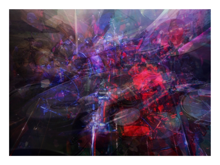
The layered version of this typology i feel works very well. the image maybe feels a little busy but not so much that it distracts. i feel this image has an exploartive feel to it. the ore you look at the image the ore you dicover.
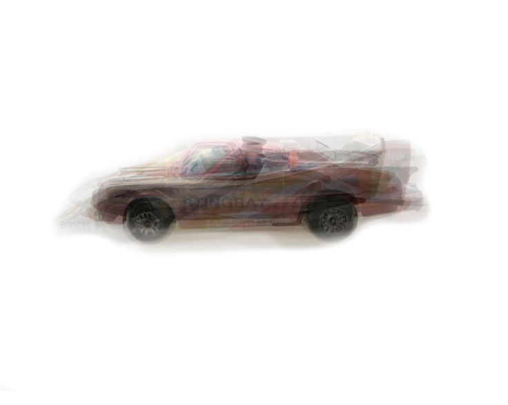
Sixth Idea – Cars / Childhood toys
This idea is something i wanted to try and adopt from a lecture on typologies. although i couldnt find 9 cars/vehicles this is more of an experimental shoot. I dont plan on using this idea for my final as i want to try and be more creative with my chosen pieces.
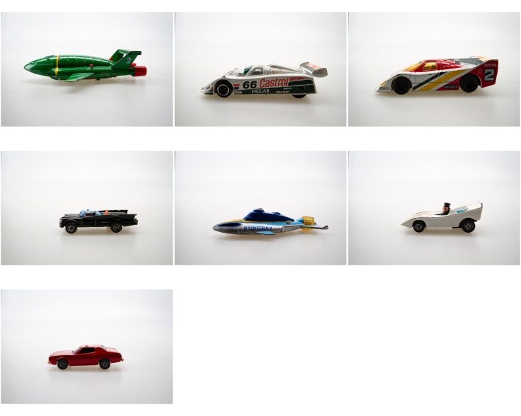
This layered image of the cars is both effective and interesting in its form and I am happy with the outcome. The individual layers can be seen clearly but this could be due to only having 7 images in the layered picture.
Seventh Idea – Doors
This idea initially came from my research. I wanted to create a typology on wooden doors. I looked for several types of wooden doors around the Hull and Beverley area. this mostly turned out to be church doors. And for this reason i wont be using this typology as my final , Although the layered image did have an appealing feel to it.
Final Image selection
Evaluation
Church Window
The images consists of a typology of church windows at the Trinity church and a layered image of church windows.
The image is composed of very strong visual elements that altogether show the concept i wanted to portray. The colour of the glass can be seen throughout the image and the overall effect is a visually interesting one. The typology works well, Unfortunately i was unable to get closer to certain windows which has given a slightly different angle to two of the windows. However i feel as though this fits with a non formal typology and still holds well in a typology grid.
This particular body of work is something i would like to continue in my own time as i feel a more expansive window collection from several churches would create an interesting piece of art/ body of work. I believe this because different churches depict different things in their windows.
The only issues i ran into with this typology was the different lighting within the church so adjusting my settings to gain the correct exposure became a challenge but also a learning curve for me.
The only adjustments i made to the images, is when i was working on the layered image. I slightly adjusted the saturation and contrast.
Nom Nom
This picture depicts a Typology of small figures know as Nom Noms. For this approach with my typology i wanted it to be a formal typology. I used the same lighting set up using a product table with an even 1:1 Ratio of light.
The layered version of this image works well and all layers can be seen effectively. I particularly like the fact that each figure has different attributes that can be seen throughout the layered image.
The only changes i have made to this images is using light room to adjust the white balance to achieve a pure white background as much as possible, giving the image an overall professional feel.
I feel I have successfully completed the objective I set out to do with this project, both technically and creatively. Studio is not my strongest area so I am very pleased with the result.
Drums
The images consists of a typology of a drummer in a club and a layered image of a drummer.
The image is composed of very strong visual elements and i feel out of all my images this is the strongest when considering composition. This typology in particular is the one i had the most fun with and experimented with. The typology works well, With this approach although it is the same drums each image is taken differently therefore making this typology an informal one.
The only issues i ran into with this typology was the different lighting within the venue and the moving lights within the club, but this posed a challenge i was happy to accept and overcome.
The only adjustments i made to the images, is when i was working on the layered image. I slightly adjusted the saturation and contrast.
Overall i am very happy with the outcome of this image.
Batteries
This picture depicts a Typology of Batteries. For this approach with my typology I Again wanted it to be a formal typology. I used the same lighting set up using a product table with an even 1:1 Ratio of light.
Both the typology and the layered image i feel are strong visually. I find the way each brand of the battery shows through the layered image gives a hazed effect as each battery is of the same size, but think this adds to the picture.
The only changes i have made to this images is using light room to adjust the white balance to achieve a pure white background as much as possible, giving the image an overall professional feel.
I feel I have successfully completed the objective I set out to do with this project, both technically and creatively.
Conclusion
In conclusion , I am very happy with the outcome. My final images I feel are strong both technically and creatively.
I found the whole experience very educational and think I have developed further, particularly in creating my own narrative and within my actual studio Work which is a weak point for me.
The experience was good and gave me a whole new perspective on how to look at things in the world and how they can be incorporated into a style of typography.
Working to a timescale is a task that I am familiar with but always seem to struggle with, however in this case i feel i did well with working to my timescale, i do wish i could have conducted a few more shoots but am overall happy with what i have chosen for my final images.
If I could change anything it would be that for certain shoots, such as the church windows could be more expansive. I would of liked to travel to to other locations and photograph church windows. this is a subject i will continue in my spare time as it has been very interesting to me.
It was very interesting to see my ideas snowball and develop from my initial ideas. They evolved and grew along with my confidence in my work.
To conclude, I completed what I set out to do by researching and completing final ideas, although some are different from my initial ideas, this I feel was the journey I was meant to go through to come to my final images and I am very happy with the end result .
Bibliography
- http://www.tate.org.uk/art/artists/bernd-becher-and-hilla-becher-718 (18/3/18)
http://jamesmollison.com/books/where-children-sleep/ (23/4/18) - jamesmollison.com/books/the-disciples-work-test-1/ (18/3/18)
- www.saatchigallery.com/artists/idris_khan.htm (15/4/18)
- https://www.creativeboom.com/inspiration/urban-etchings-artist-layers-multiple-images-to-give-the-impression-of-pencil-drawings/ (12/4/18)
- https://www.artsy.net/show/robert-mann-gallery-jeff-brouws-typologies-projects-and-portfolios (16/3/18)
- http://cargocollective.com/stevetylerphotography/Typologies-of-Mass-Consumption (20/4/18)

Leave a comment